If you cannot see images, please click here

MAY 31, 2022

A is for Ox (A is van Os)

我們的字母從哪裡來?


任何一個識字的人都知道26個英文字母。但這些字母是從哪裡來的呢?他們存在多久了?誰設計了這些字母?你知道每個字母分別來自於什麼嗎?

英文字母的歷史,要從古埃及開始說起。公元前27世紀,古埃及人發展出一套含22個單音的象形文字來表達他們語言的子音,第23個字元推測是用來表示字首和字尾的母音。這些字元成為意音文字的發音、文法和變調標記,後來也用於表示外來語和人名。儘管是字母的原始形式,這套系統並沒有獨立用於書寫。第一種單純用作書寫的文字約於公元前20世紀,由埃及中部的閃米特人發明。經過五個世紀,這套字母向北傳開。後來全世界大多數的字母系統都承襲於此。唯一可能的例外是梅羅字母,這是種公元前3世紀努比亞至埃及南部一帶的象形文字變形。


為了將字母的歷史更廣泛地傳達,荷蘭的設計工作室Autobahn聯合金石筆獎得主Bette Westera引領你回到我們遙遠的祖先時代,那時當老祖先要“寫”東西的時候,他們通常用一些圖畫來表達。漸漸地,他們的圖畫變成了最先的字母。原來,A並不來自Apple, 而是Ox!讀了這本書之後你將明白這其中的道理,原因是什麼。任何時候當我們發emoji表情給對方,實際上我們跟5000多年前的祖先正在做一樣的事情。


書名:A is for Ox (A is van Os)

作者:Bette Westera

概念&插圖:Autobahn

語言:荷蘭語

精裝,24 x 24 cm,80頁,3~12歲

出版社:Gottmer

出版時間:2018年6月

已授權:法語,簡體中文(即將出版)

審讀材料:原文PDF,英文翻譯樣張


該書受到「荷蘭文學基金會」支持,提供翻譯津貼,詳情請訪問:HERE


如有興趣評估此書,請聯絡Kris登記、索取檔案。


A. Back in time

Our letters - p. 9

From drawings to letters - p. 12

With a caravan through the desert - p. 14

How it went on - p. 20


B. All letters in a row

The alphabet from A to Z - p. 24

These weren't all letters, were they? - p. 62


C. Letters aren't everything, either

What does this say? - p. 70

The Story Continues - p. 74

Get started yourself - p. 76


About the authors - p. 79

A is van Os has earned Type Directors Club award for typographic excellence and is traveling in exhibitions to Vietnam, Cambodia, Canada, Germany, France, USA, Australia etc.


The publication is nominated for ADCN Dutch Creativity Award.


The publication is also nominated for European Design Award.

‘5 out of 5 stars ’ Volkskrant newspaper


‘A highly original book about the emergence of our alphabet in a tight and inventive design ’ / Trouw newspaper


‘A big ten ’ / The Happy Reader


‘The origin of letters - what a good idea for a children’s book! ’ / NRC newspaper


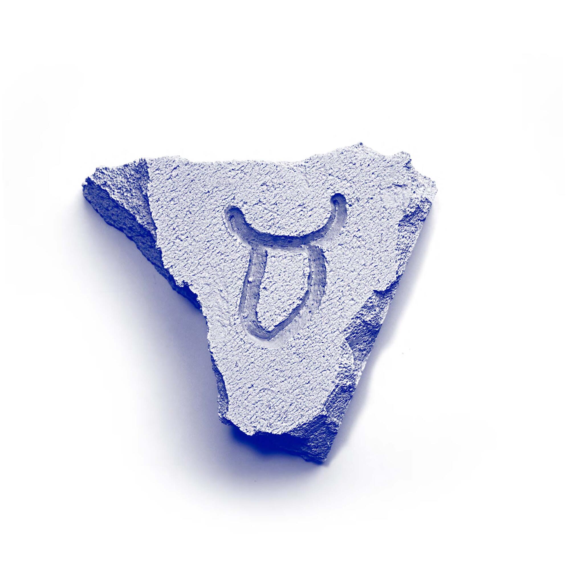
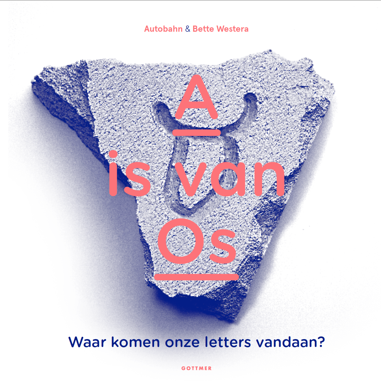
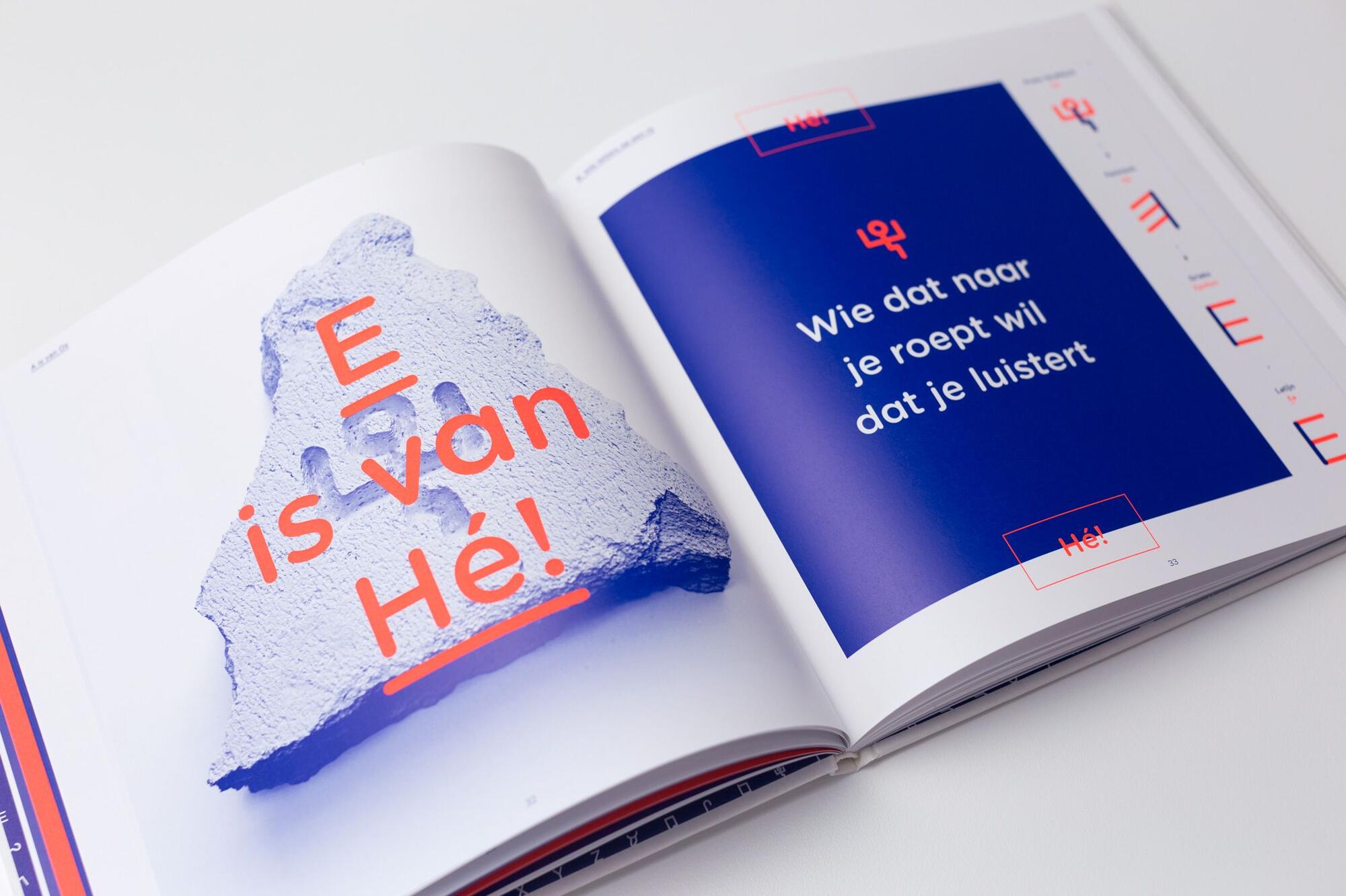
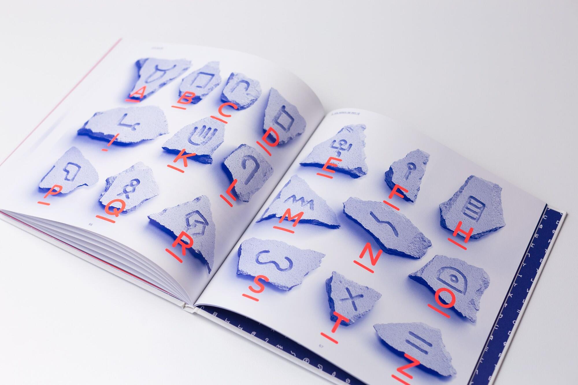
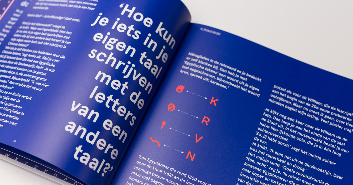
Volkskrant

A is not at all for ‘apple’, but for ‘ox’. Most gymnasians know that. But what about the other eighteen letters that form the basis of our alphabet through Greek and Latin? The D is from ‘door’. The E of ‘Hey, you there!’, The L is a rope to tie the donkey to a post and the M is for ‘water’. Just look, then you’ll see it.

To immediately remove the impression that A is for Ox, from the writer Bette Westera and the graphic agency Autobahn, only exists for prospective scientists: that is not the case. The Autobahn professional lettermakers found an ingenious way to shape the letter evolution from Proto-Sinaitic to Greek and Latin. By dividing each letter into two parts, the one orange and the other colored blue, the development through thousands of years of writing history can easily be traced back.

Once you have seen the little arms of the person who calls ‘Hey you there’, you will always recognize them in the E. And the H is of course a ‘fence’, what could it be otherwise? Westera tells a micro-story of one sentence accompanying each letter. About caravans and deserts, rivers that bring fertile silt, oxen that help to plough the tough clay, pins that help keep a tent upright. Thus each letter represents a case that was of vital importance in ancient times.

There is no big difference, says Westera, between the origin of letters and the pictures people use today to express what they find important during the app. The story of our alphabet has been told and shown more often. But rarely as inspiring as here.

Pjotr van Lenteren 24 August 2018, 15:00

關於作者

Bette Westera 為兒童寫詩、歌曲、故事和內容豐富的書籍。 
她的作品Doodgewoon (Gottmer, 2014) 被授予 Woutertje Pieterse 獎、金格蘭傑獎和金詩歌獎章。 
Bette 的其他著名書籍有All hands on deck, Hero on Socks, Poor Empire(一個閱讀和聆聽的童話)和Was the earth once flat?。 

Bette和她的吉他手Diederik van Essel合作演出了她的作品。 

“只寫你理解的東西,”貝特在她的網站上說。 “即便是一部完全自製的關於海盜或者牛仔的小說,你也應該知道一點關於海盜或者牛仔的事情。” 
當 Autobahn 讓她為一本關於我們字母起源的書寫文字時,她把自己定下的規則拋在腦後。 "我從來沒有做過,所以我想我可以做到," 她決定,完全本著 Pippi Longstocking 的精神。 她開始寫她所不知道的事情。 雖然沒有立刻獲得成功,但是很慶幸,萊頓埃及古物學家 BenHalin為她提供了幫助。 她變得更聰明了! 


Autobahn 是來自烏得勒支的設計工作室。 
該工作室的創始人兼設計師Maarten Dullemeijer 和 Rob Stolte在中國,西班牙,比利時,秘魯以及荷蘭展出了自己的作品。 除了為客戶服務外,兩人還經常開發自主專案,例如 FreshFonts:由牙膏 (Heldentica)、番茄醬 (Tomatica) 和髮膠 (Gelvetica) 製成的字體,這是一個面向設計師的排版測驗和可持續性平臺。 他們的作品獲得了六項歐洲設計大獎。 
A is van Os 的創意源於 Autobahn 的理念:文本即圖像。 文字既可以是插圖,也可以是資訊載體。 然後讀者可以決定:「我應該閱讀文字還是查看圖像? 」事實是我們不能同時閱讀文本和查看圖像。 
Autobahn 稱之為令人愉快的混亂,因此它在他們的設計中發揮了一定的作用。 當Stolte四歲的兒子開始學習寫字時,他很快就決定要做一本兒童讀物。 因為每個學寫字的人都必須瞭解我們的字母來自哪裡。 字母A根本不是來自Apple,而是Ox!

查看全部書訊

感謝閱讀

我們期待收到您的來信

祝 一切順利


Kris Guo

Jade Literary Agency

一隅版权代理(广州)工作室  


[email protected]

+86 13676247207


原创版权输出  外文版权引进

www.jadeliteraryagency.com


Jade Literary Agency is a foreign rights agency that introduces foreign books into the Chinese market as well as Chinese books to the rest of the globe. 


This email was sent to you because you are on our mailing list. If you do not want to receive our newsletter, please click Unsubscribe or just let us know. Thank you very much.